
Remember when bands used logos? It’s not as common anymore, but there are still a few that do it. However, I’m specifically talking about logos with cool illustrations. Today, I want to take a look back at the 10 most memorable logos that were consistently used by mainstream bands. And hey, let’s give credit where credit is due and try to track down the designers behind these awesome logos. Again, this is just ones with illustrations not cool fonts. Stay tuned for another post another day on bands with cool custom typefaces for their logos. Rock on!
#10 AC/DC
![]()
The logo for the band, with its iconic electrical bolt, is nearly just a typographic design. But I couldn’t resist including it because it has been consistently used on every album and merchandise. It’s a prime example of how a simple icon can connect to the band’s name and remain timeless. Graphic designer Gerard Huerta collaborated with Atlantic Records art director Bob Defrin to create this iconic design. It’s a logo that truly stands the test of time.
#9 Van Halen
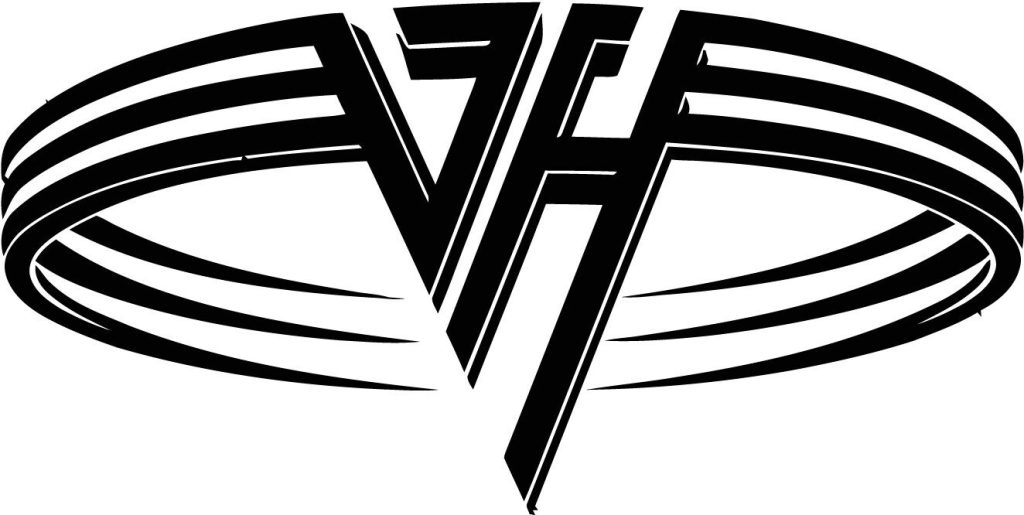
The Van Halen logo, created in 1978 by Dave Bhang, is nearly a typeface logo. While it doesn’t include the full band name, anyone familiar with the 80s and 90s music scene knows exactly who it represents. The logo, with its stylized VH, was consistently used for many years, although it did undergo a change when Sammy Hager joined the band. Nevertheless, the VH remains memorable and represents one of the best guitarists of all time. Eddie Van Halen’s talent allowed the band name to transcend two memorable lead singers, maintaining its identity. Bhang, a professional designer since 1964, also worked with notable artists such as the Beach Boys, Pointer Sisters, Frank Sinatra, Bobby Womack, and Ike & Tina Turner. His work on the Van Halen logo adds to his impressive portfolio.
#8 The Who
![]()
The iconic logo of The Who, designed by artist Brian Pike, may not have graced the front of their albums, but it became a staple on their posters and merch. In the 1950s, the mod subculture in post-war Britain embraced the red, white, and blue target as a symbol of their movement. Pike’s design elevated its fame even further. The arrow on the ‘o’ exudes masculinity, while the clever combination of the two ‘h’s represents unity. It’s a logo that captures the spirit of The Who and the mod subculture in one bold image.
#7 Sublime
![]()
Sublime is undeniably one of the best bands of my generation, with a distinct and powerful identity. Personally, I best enjoy their music on scorching summer days – it just feels right. Perhaps I love this logo because I’ve sported it on a t-shirt for countless years. Sublime merchandise holds a special place, as it not only identifies the wearer as a fan of the band and their unique sound, but also connects them to a larger scene, an exclusive tribe, if you will. It’s like waving a tribal flag. Tribal artwork gained significant popularity in the 90s, permeating various aspects of American music and youth culture, and Sublime’s sun design stands as one of the greatest examples. This iconic sun was created by Opie Ortiz, a talented tattoo artist and muralist from LA. You can find Ortiz’s murals scattered throughout Long Beach, California.
#6 Led Zeppelin
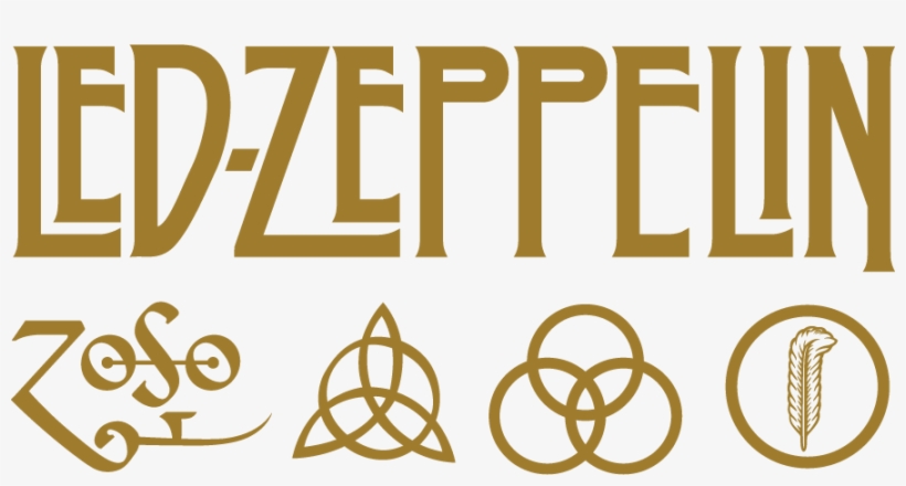
Led Zeppelin IV, one of their most successful albums, introduced symbols that represented each of the band members. Jimmy Page’s symbol, the ZoSo, dates back to the 15th century and symbolizes Saturn. John Paul Jones, the bassist, had a symbol consisting of a circle intersecting three vesica pisces symbols, representing confidence and competence. John Bonham, the drummer, had three interlocking rings symbolizing the mother, the father, and the child. And Robert Plant, the singer, had a symbol of a feather inside a circle, representing a writer. These symbols not only added a unique touch to the album, but also showcased the individuality and creativity of each band member, and this became a unique identity for Led Zeppelin over their prime years.
#5 Limp Bizkit
![]()
Look, I get it. Limp Bizkit and their crew aren’t everyone’s cup of tea. But let me tell you, if you were a teenager in the late 90s or Y2K like me, and you claim you didn’t blast Limp Bizkit in your room or car to blow off some steam, well, you’re just not being honest. Remember that colorful graffiti dude on the cover of their hit album, Significant Other? Yeah, that’s the same silhouette they’ve been rocking in this logo since those days. Their music, along with the whole NuMetal scene, really spoke to rebellious souls like mine. It was fresh, powerful, and damn epic. Mear One, the artist behind the graffiti art dude, is a legend in LA’s mural scene. This was the golden era of NuMetal, with bands like Korn, Linkin Park, and System of a Down ruling the airwaves. Trust me, they’re still a major part of my Spotify playlists.
#4 Aerosmith
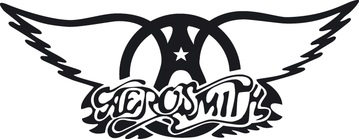
I’ve always been a huge Aerosmith fan and I’m beyond excited to finally see them live in November 2023. Their logo is seriously memorable, with those iconic wings and peace symbol that you see on so many album covers and merch. It’s no wonder they’ve been one of the most popular rock bands in the world for years. But here’s the kicker – their logo wasn’t some fancy design from a record label or a hired artist. Nope, it was actually created back in 1974 by the band’s own guitarist and founding member, Raymond Tabano.
#3 Grateful Dead
![]()
The Grateful Dead’s logo, known as the “Steal Your Face” logo, is adored by deadheads worldwide. It’s so iconic that it doesn’t even need the Grateful Dead name to be recognized. But did you know that they had several other logos throughout the years? They used logos like Dancing Bears, Skull and Roses, and even an Uncle Sam Skeleton. Fun fact: the “Steal Your Face” logo was actually the brainchild of the band’s sound guys. Stanley Owsley came up with the idea of the bolt and circle, and Bob Watson sketched it out. The main purpose of the logo was to have a spray-paint stencil to mark their equipment at shows. The skull was added later.
#2 Public Enemy

Chuck D, the frontman of Public Enemy, designed the iconic crosshairs logo in 1986. Back then, he didn’t have fancy tools like computers or Photoshop. He relied on good old magic markers, white-out, and Exacto knives, so he says. The figure in the logo is often mistaken for a state trooper because of his hat, but he’s actually a representation of a break dancer or “b-boy.” And that hat? It’s a nod to the legendary hip-hop group Run-D.M.C., one of my personal favorites. The crosshairs in the logo is symbolic of all the violence in America. Public Enemy has been a powerful advocate for change on this issue for many years.
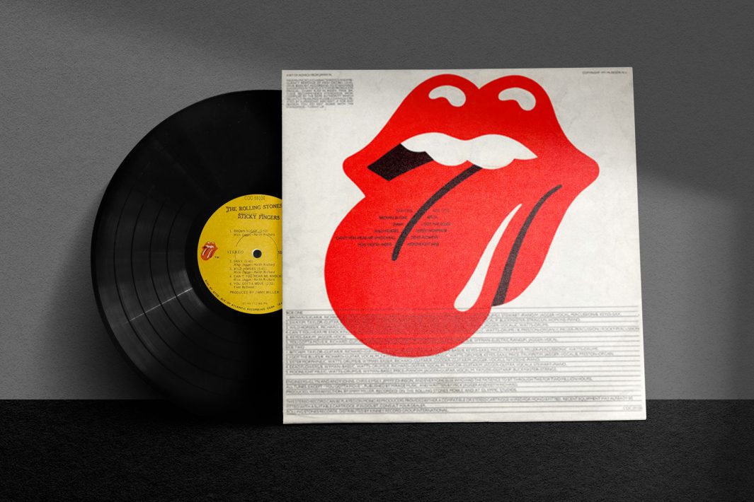
#1 Rolling Stones

The lips logo, first featured on the album art for Sticky Fingers, is undeniably one of the most iconic symbols in music. It has stood the test of time, adorning countless t-shirts both then and now. Created by art student John Pasche in 1973, the logo was inspired by Mick Jagger’s unmistakable mouth and lips. The protruding tongue adds a touch of sexuality and rebelliousness, perfectly capturing the essence of the Rolling Stones’ music and personas. In my opinion, the lips logo is a brilliant and enduring representation of the band’s rock ‘n’ roll spirit and absolutely my vote for most iconic band logo of all time.